The Admin Experience Redesign: What We Changed and Why
The Case for a Redesign
Design trends move. What feels modern and purposeful when something is first released can start to feel cluttered and dated as the broader landscape evolves and the product itself grows.
SparkLearn has added a lot of features over its ongoing development and growth. That's a good thing. But every new capability added to an existing interface is a little like building an addition onto a house: done incrementally, things can start to feel mismatched. Navigation grows. Sections multiply. The overall layout starts to reflect the history of the product rather than how you actually work in it today.
At the same time, the design conventions we all operate by have shifted. Bold, high-contrast, content-dense interfaces were once the norm. The current standard is cleaner, favoring subtle pops of color, more whitespace, and more focus on the content itself, right in line with the tools most teams already use every day.
We have big plans for where SparkLearn is going. Before building more on top of what existed, we wanted a foundation that would support that growth cleanly. We redesigned the admin experience, not to change what it does, but to bring it fully in line with where design and usability standards are now, and to give ourselves a better canvas for what comes next.
What Changed and Why It Matters
A Visual Language That Works Harder
The most immediately noticeable change is the theme. The before and after speak for itself but let’s dig into it.
Admin Dashboard – Before
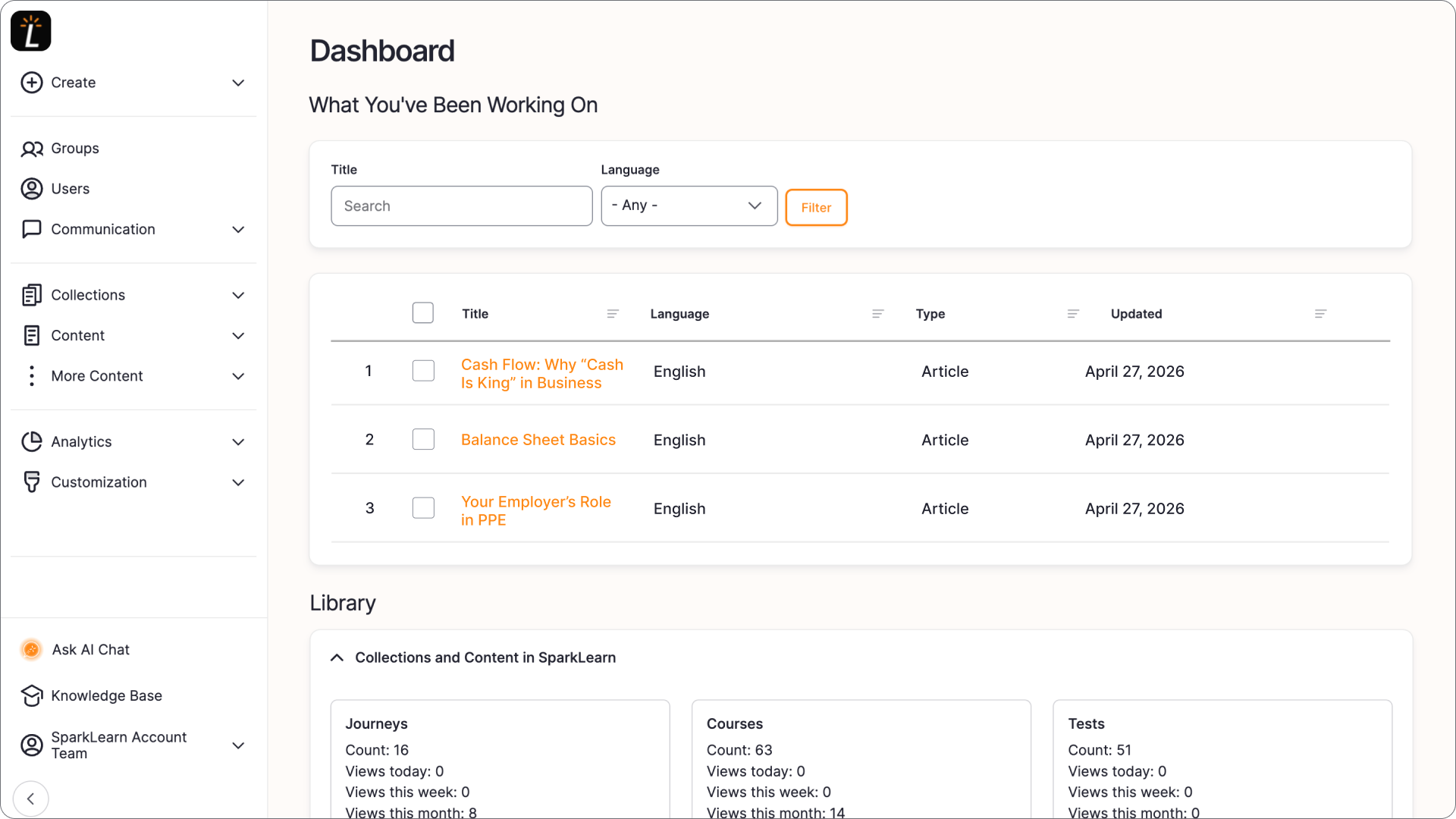
Admin Dashboard – After
In the previous editor, the content editing fields occupied the center of the screen, with a preview panel to the right. But additional options and actions like Save and Publish lived at the bottom of the screen. In longer or more complex articles, that meant a lot of scrolling.
The new editor addresses this directly. Primary action buttons are now fixed in the upper right corner of the screen, visible and reachable at all times regardless of where you are on the page. Additional options are tucked into a side panel to keep the interface uncluttered. Best of all, the editing fields and content preview now scroll independently so you can work your way through a long article without losing sight of how the content will appear to learners.
The practical result is a workflow where the tools you need most are in front of you. The options you need occasionally are within reach but not in the way. Content gets built faster with less friction and fewer swipes to get to the bottom of the page.
A Navigation That Gets Out of the Way
The collapsible navigation is updated with clear iconography for each section. At the bottom of the sidebar, links to access AI Chat, Knowledge Base, and your account are persistent and convenient without taking up precious screen real estate.
The menu order was also reconsidered to better reflect how SparkLearn is actually structured. The hierarchy of the menu now matches the hierarchy of the content itself. This means less mental translation between what you're building, where you go to build it, and its place within your content.
Perhaps most exciting is the new +Create button pinned at the top of the sidebar that allows you to quickly start building from wherever you are in the platform.
Responsive Design That Scales with Your Screen
Admins work in a lot of different environments. A 13-inch laptop during a commute. A 27-inch monitor in the office. A tablet in the field. While our product has always been fully responsive, at higher resolutions, the previous interface could feel oversized; on smaller devices, things got cramped and excessive scrolling crept in.
The new design uses responsive typography and a fluid layout so the interface scales properly regardless of where you're working. Navigation adapts. Content areas make the most of the space they actually have. Typography is appropriately sized for the screen it's on.
The practical result: the admin experience now feels intentional. Everything fits, everything adapts, and the layout stays clean regardless of screen size.
The Content Editor: Less Scrolling, More Doing
Nowhere is the difference between old and new more tangible than in the article editing experience because it's where admins spend the most time.
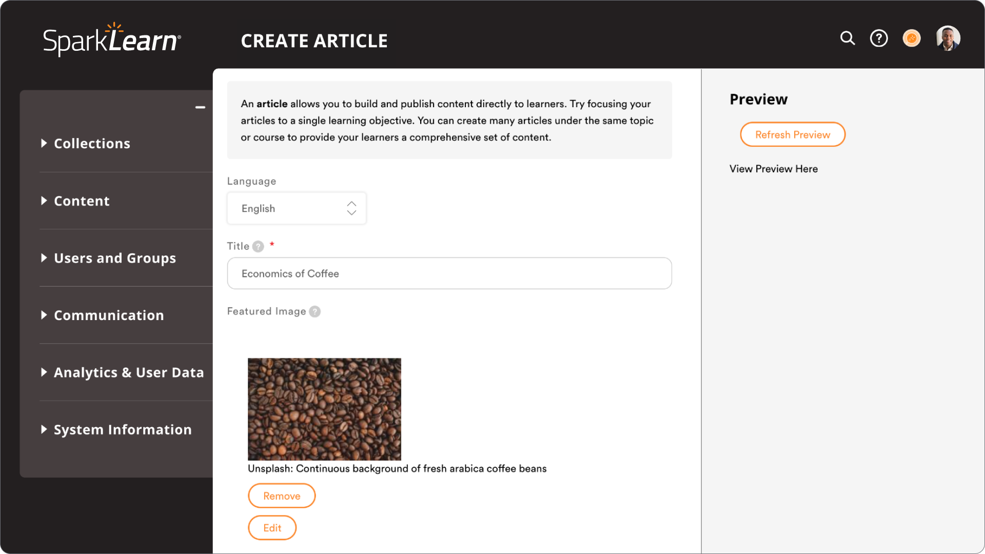
Create/Edit Article – Old
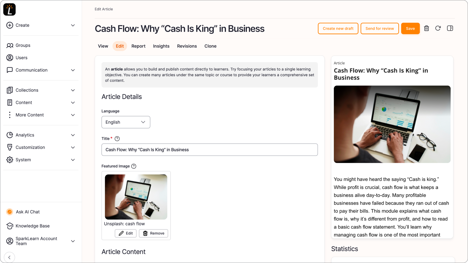
Create/Edit Article – New
In the previous editor, the content editing fields occupied the center of the screen, with a preview panel to the right. But additional options and actions like Save and Publish lived at the bottom of the screen. In longer or more complex articles, that meant a lot of scrolling.
The new editor addresses this directly. Primary action buttons are now fixed in the upper right corner of the screen, visible and reachable at all times regardless of where you are on the page. Additional options are tucked into a side panel to keep the interface uncluttered. Best of all, the editing fields and content preview now scroll independently so you can work your way through a long article without losing sight of how the content will appear to learners.
The practical result is a workflow where the tools you need most are in front of you. The options you need occasionally are within reach but not in the way. Content gets built faster with less friction and fewer swipes to get to the bottom of the page.
An Experience That’s Easy on the Eyes
The redesign has also brought meaningful accessibility improvements. The shift to a lighter, simplified color palette improves readability across the board while still allowing your brand to shine through. Text is easier to parse, interactive elements are easier to distinguish, and overall visual hierarchy is clearer.
This isn’t just about aesthetics though. Your admin team includes people with a range of visual needs, working across a range of lighting conditions and display types. An interface that's easier to read and navigate isn't just better for accessibility, it's less fatiguing to use for everyone, every day.
Why Now
We could have kept the old interface indefinitely. It worked. Customers used it. Features shipped on top of it. But interfaces that work and interfaces that serve you well over the long run aren't always the same thing.
The timing came down to two things. First, the gap between where design conventions have moved and where our interface was has grown wide enough that it made sense to close it properly rather than patch it incrementally. Second, we have real plans for where SparkLearn is going – new capabilities, deeper workflows, more for admins to get into – and we wanted the foundation to be right before we built more on top of it.
The redesign is as much about where we're going as it is about where we are.
What's Next
The admin redesign in 5.0 is a foundation, not a finish line. We're continuing to evaluate how content managers use the platform, where workflows can be tightened further, and where new capabilities can be added without adding complexity.
That mindset has always shaped how we build. Not big-bang releases followed by long silences, but steady improvement grounded in how real teams work.
If you're an existing SparkLearn customer and want a walkthrough of the updated admin experience, your Customer Success manager can walk you through it. If you're evaluating SparkLearn for the first time, 5.0 is a good place to start. The interface you see today reflects where we are and where we’re headed.